

Type of Work: Data Visualization
Spring 2017
The Iraq Body Count, conducted by independent researchers in England through the aid of Iraqi police and news sources, catalogues the number of Iraqi civilian deaths due to violence since 2003. Looking at their lists of monthly, annual, and total casualties is overwhelming. Charts of numbers make it difficult to compare what years were the most dangerous and in what months Iraqi civilians lived in relative peace. Numbers presented in lists and charts obscure the true story of Iraq and its citizens.
I created this data visualization to better tell the story behind the numbers.
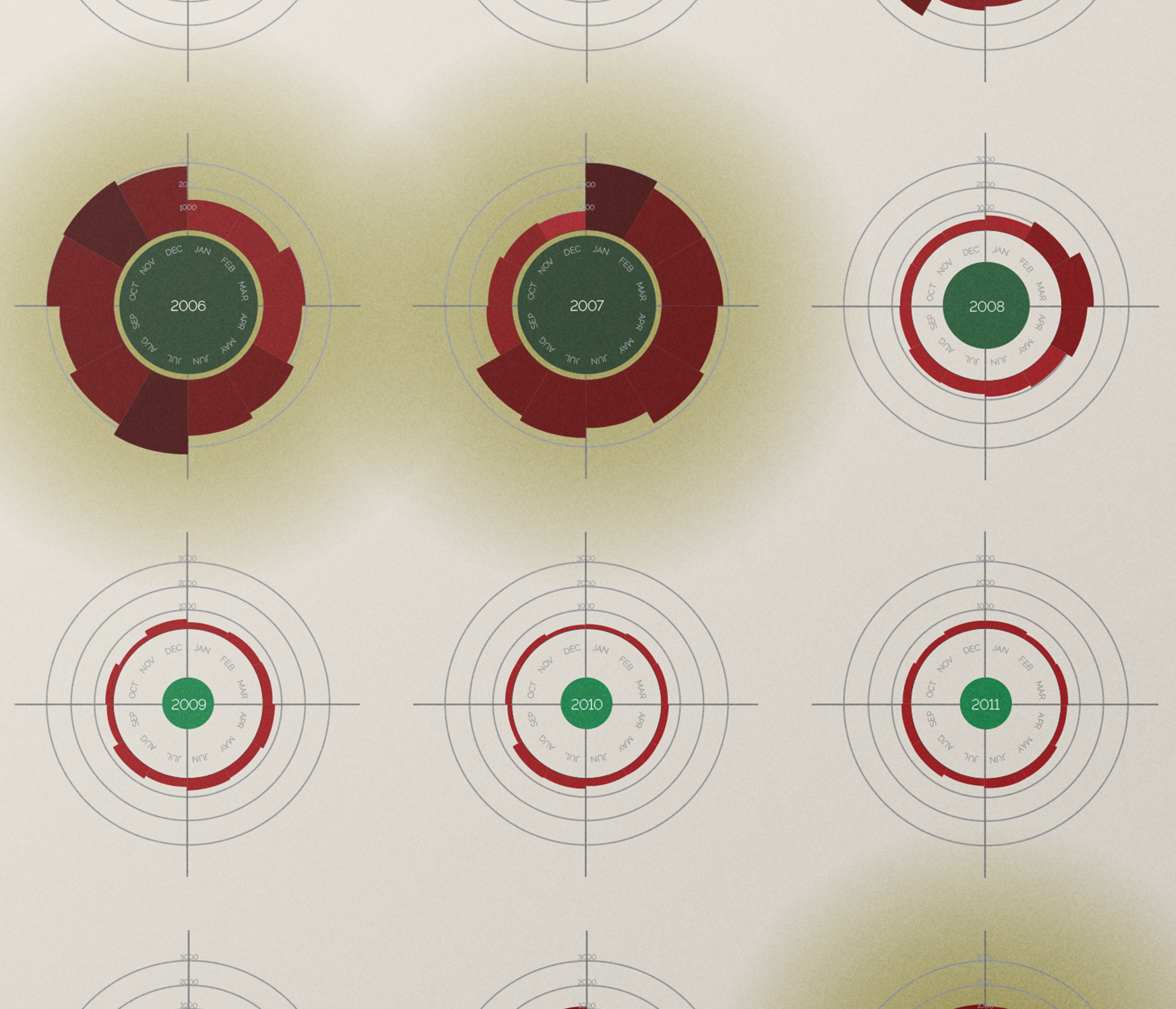
In this graphic, I present the total number of documented Iraqi civilian deaths from violence of any kind between 2003–2016. Each year’s death count is shown on its own circular graph. The bars on these circular graphs show monthly counts of violent civilian deaths; the taller and darker the bar, the higher the death count. The green circles within each graph show relative yearly counts of violent civilian deaths, with the largest and darkest circles indicating the deadliest years. The three deadliest years (2007 and 2008, during the American occupation of Iraq, and 2014 during ISIS’ rise to power) are highlighted by a bruise-colored spotlight. By showing data in this manner, the graphs create a shape that resembles the crosshairs of an assault weapon and the spotlights illuminate the years that most wounded an ailing nation. This visually, statistically, and emotionally tells the stories of the innocent Iraqi civilians who were caught in the crosshairs of deadly conflict.

